
Your event has a date, artist, and venue. But if your event landing page isn't designed to sell, you're losing tickets every minute. 70% of visitors abandon an event page before 10 seconds if they don't find what they're looking for: date, price, and buy button. This guide gives you the exact structure, section by section, to turn your landing page visitors into buyers.
What you'll find here: The ideal structure template with detailed breakdown, conversion-killing mistakes, a 25-point launch checklist, and answers to the most common event landing page questions for the US market.
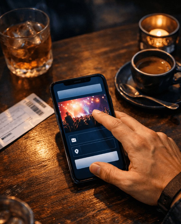
▶ Your landing page's main CTA: "Buy Tickets" — visible, direct, no confusion.
What is an Event Landing Page and Why You Need One?
An event landing page is a web page with a single goal: get the visitor to buy their ticket. Unlike a general website or social media profile, this page eliminates distractions and focuses all attention on conversion. It doesn't have a complex navigation menu or links that lead elsewhere. It has one mission: sell.
For event organizers and promoters in the US, the event landing page functions as the ultimate digital storefront. This is where traffic from social media, email marketing campaigns, and Google searches lands. If that page isn't optimized, you're literally burning advertising budget: every click you pay for on Instagram or Google Ads takes someone to a page that doesn't close the sale.estrategias de marketing para eventos que realmente convierten
The difference between an event that sells out and one that's half empty often isn't in the lineup or the date: it's in the sales page. A well-built event landing page can multiply conversion rates 2x to 5x compared to a generic link to a ticket marketplace.
Ideal Event Landing Page Structure (Section-by-Section Template)
This is the structure template you should follow. Each section serves a specific function in the buyer's decision journey. Don't skip them, don't change the order. It's proven.
Section | What it should say | Why it converts |
|---|---|---|
1. Hero / Header | Event name + date + venue + "Buy Tickets" CTA. High-quality image or video background. | Answers the 3 urgent questions (what, when, where) in under 3 seconds. Visible CTA without scrolling reduces early abandonment. |
2. Value Proposition | 1-2 sentences explaining why this event is unmissable. Emotional benefit: "The night you'll remember all year." | Activates emotional desire. Buyers don't purchase an event, they buy an experience. The value proposition connects with that expectation. |
3. Event Details | Exact date and time, address with embedded map, estimated duration, dress code if applicable, age restrictions. | Eliminates information friction. Every missing detail is an excuse not to buy. The map reduces the "I don't know how to get there" barrier. |
4. Lineup / Program | Artists, speakers, or activities with photo, name, and brief description. Schedule if defined. | Social proof by association: known names validate event quality. Detailed program justifies the investment. |
5. Ticket Types | Clear categories (General, VIP, Early Bird) with what each includes. Buy button for each category. | Simplifies decision-making. Buyers choose quickly when options are clear. CTA per category reduces steps. |
6. Social Proof | Testimonials, photos from previous editions, sponsor or media logos, tickets sold counter. | Reduces perceived risk. If others went and had fun, I'll have fun too. Numbers generate urgency. |
7. Event FAQ | 3-5 frequent questions: parking, accessibility, refund policy, minimum age. | Resolves final objections without the user having to search elsewhere. Each answered question is one less barrier to purchase. |
8. Final CTA + Urgency | "Few tickets left" or "Discount until [date]" + large, visible buy button. | Scarcity and urgency principles push the final decision. Repeated CTA captures those who scrolled all the way down. |
Key insight: if you use a white-label ticketing platform like Fanz, this entire structure lives on your own domain (yourevent.com), with your branding and colors. The buyer never leaves your brand universe.
Event Landing Page Copywriting that Actually Converts
Your event landing page copy isn't literature. It's sales. Every word must push the reader toward the buy button. Here are the principles and concrete examples.
Headlines that Capture in 2 Seconds
Your landing page headline is the first (and sometimes only) opportunity to capture attention. It must communicate the event's main benefit, not just the name.
Bad example: "Electronic Party 2026". Says what, but not why I should care.
Good example: "The Biggest Electronic Festival in Chicago — 3 Stages, 12 DJs, One Night". Communicates scale, variety, and exclusivity.
Microcopy that Drives Conversion
Microcopy are those small phrases around buttons, forms, and ticket selectors. They're small but decisive.
Next to buy button: "100% secure checkout with Stripe" — reduces transaction anxiety.
Below categories: "Only 47 Early Bird tickets left" — real urgency, not invented.
In the footer: "Organized by [your brand] — 5th consecutive edition" — credibility and track record.
Near testimonials: "+2,000 people chose to live this experience" — numerical social proof.
The Ideal Tone for the US
In the US, converting copy is direct, engaging, and conversational. Your audience expects you to speak to them like a friend, not a corporation. Avoid cold corporate tone and overly formal language.
Use action verbs: "Secure your spot", "Buy now", "Don't miss out". Avoid "Purchase your admission" or "Register your attendance", which sound distant and corporate.
UX and Design that Prevents Event Landing Page Abandonment
The world's best copy fails if the user experience is poor. Here's a UX checklist specific to event landing pages that minimizes abandonment.
Essential UX Checklist
Mobile first. Over 80% of event traffic in the US comes from mobile devices. If your landing page doesn't look perfect on mobile, you're losing 8 out of 10 visitors.
Load speed < 3 seconds. Compress images, use WebP formats, and avoid heavy videos that don't autoplay.
CTA visible without scrolling. The "Buy Tickets" button must be above the fold on both desktop and mobile.
Color contrast on buttons. The buy button should stand out from the background. If your landing is dark, use a bright button. If light, use a solid, saturated tone.
Minimal navigation. Remove the full navigation menu. An event landing page isn't your website: it's a sales page. Every link that isn't "Buy" is a leak.
Readable typography. Minimum 16px on mobile for body text. Large headlines with contrast. No decorative fonts that sacrifice readability.
Clear visual hierarchy. The eye should be able to scan the page in Z or F pattern: from headline to image, image to CTA, CTA to details.
When your landing lives on your own domain with white labeling, every visual element reinforces your brand: colors, logo, typography. The buyer feels they're purchasing from your event, not a generic third-party platform.
Remarketing to Recover Lost Ticket Sales
Here's a stat that should change how you think about your sales: between 60% and 80% of people who visit your event landing page leave without buying. Not because they're not interested, but because they got distracted, had doubts, or it simply wasn't the right time.
Remarketing is the strategy that lets you recover those people. Instead of losing that traffic forever, you send them a personalized message (email, notification, or ad) that reminds them your event exists and tickets are selling out.
How Automated Event Remarketing Works
The ideal flow looks like this:
The visitor enters your event landing page and sees the info, but doesn't buy.
Your ticketing platform registers that visit and associates it with a contact (if they previously left an email or interacted with a chatbot).
An automatic sequence activates: first email after 2 hours ("We saved your spot"), second email after 24 hours ("Few tickets left").
If they still don't buy, a remarketing bot via WhatsApp or email launches a final reminder with real urgency.
Fanz includes AI-powered email marketing tools and automated remarketing botscómo aprovechar los datos de compradores para potenciar el remarketing that do exactly this: detect undecided visitors and send them personalized messages to recover that seemingly lost sale. All without you having to write a single email manually.
The key is that this data is yours. When you sell on a generic platform, the buyer database belongs to the platform. When you sell on your own white-label landing page and collect payments with Stripe directly to your accountplataforma de tickets con Stripe para cobrar directo sin intermediarios, every contact stays in your database for future editions, launches, and loyalty strategies.
7 Typical Mistakes that Destroy Event Landing Page Conversions
If your landing page isn't converting, you're probably making one (or several) of these mistakes. They're the most common in the US market and all have solutions.
Mistake 1: No visible CTA without scrolling. If the visitor has to search for the buy button, you've already lost them. The CTA goes above the fold, always.
Mistake 2: Sending traffic to a marketplace instead of your landing. When you send people to a ticket marketplace, they compete with other events on the same page. Your advertising investment ends up benefiting your competition.
Mistake 3: Low-quality images or no images. Events are visual by nature. Blurry, pixelated, or generic photos destroy quality perception.
Mistake 4: Slow landing on mobile. Each extra second of loading increases bounce rate by 20%. Optimize images, minimize scripts, use fast hosting.
Mistake 5: Missing basic information. If I can't find the date, venue, and what each ticket includes in 10 seconds, I'm gone. Don't assume people "already know".
Mistake 6: Not doing remarketing. Losing 70% of your visitors without doing anything to recover them is throwing money away. Automated remarketing is the safety net your landing needs.
Mistake 7: Not using your own domain. When your URL says otherplatform.com/yourevent instead of yourevent.com, you lose credibility, SEO, and your buyers' data. Your brand deserves its own space.
Final Checklist: 25 Points to Launch Your Event Landing Page Without Errors
Before activating campaigns or sharing the link on social media, run your landing page through these 25 points. If you don't meet at least 20, better adjust before spending on advertising.
Content and Copy
The event name is in the H1 and is clear.
Date, time, and venue appear within the first 3 seconds of scrolling.
There's an emotional value proposition (not just informational).
Ticket categories are explained with what each includes.
Copy uses conversational tone without unnecessary formalities.
There's at least one element of real urgency (limited tickets, deadline).
Design and UX
The landing looks perfect on mobile (test on 3 different devices).
Loads in under 3 seconds (verify with PageSpeed Insights).
The "Buy Tickets" CTA is visible without scrolling.
The buy button has clear contrast against the background.
There's no navigation menu to distract.
Images are high quality and optimized (WebP).
Typography is readable on mobile (≥16px).
There's a clear visual hierarchy that guides the eye.
Technical and Payments
SSL certificate is active (https://).
Payment methods include major credit cards, ACH, and Apple Pay.
Checkout process is simple (maximum 2 steps).
There's a progress indicator during purchase.
Confirmation emails are automatic and professional.
Google Analytics or similar tracking is installed.
Facebook Pixel is configured for remarketing.
Social Proof and Trust
There are testimonials from previous attendees or recognizable names.
Sponsor or media partner logos are visible.
There's contact information for questions (email or phone).
Refund or transfer policy is clearly stated.
Pro tip: If you're organizing festivals like music events comparable to Coachella, SXSW, or Lollapalooza, emphasize the experience and lifestyle aspect. US audiences buy into the full experience, not just the lineup.
A properly structured event landing page with your own branding, optimized UX, and automated remarketing can be the difference between a sold-out event and empty seats. Every element works together to guide the visitor from curiosity to purchase, eliminating friction and maximizing conversions.
Tags